Introduction
Hello! As Instagram devolves into a video-first app, I've decided that a newsletter is an optimal way to share my work, thoughts, and inspirations. Rest assured, I don't intend to spam you with weekly dispatches. Instead, I aim to send newsletters three to four times a year. Each issue will follow a consistent format: a main story about a specific project, a few brief news updates, and a list of my current inspirations. This issue I’ll be focusing on a new zine I’ve recently released titled The Sun Was Gold Like A Yolk Dripping. Let’s dive in.
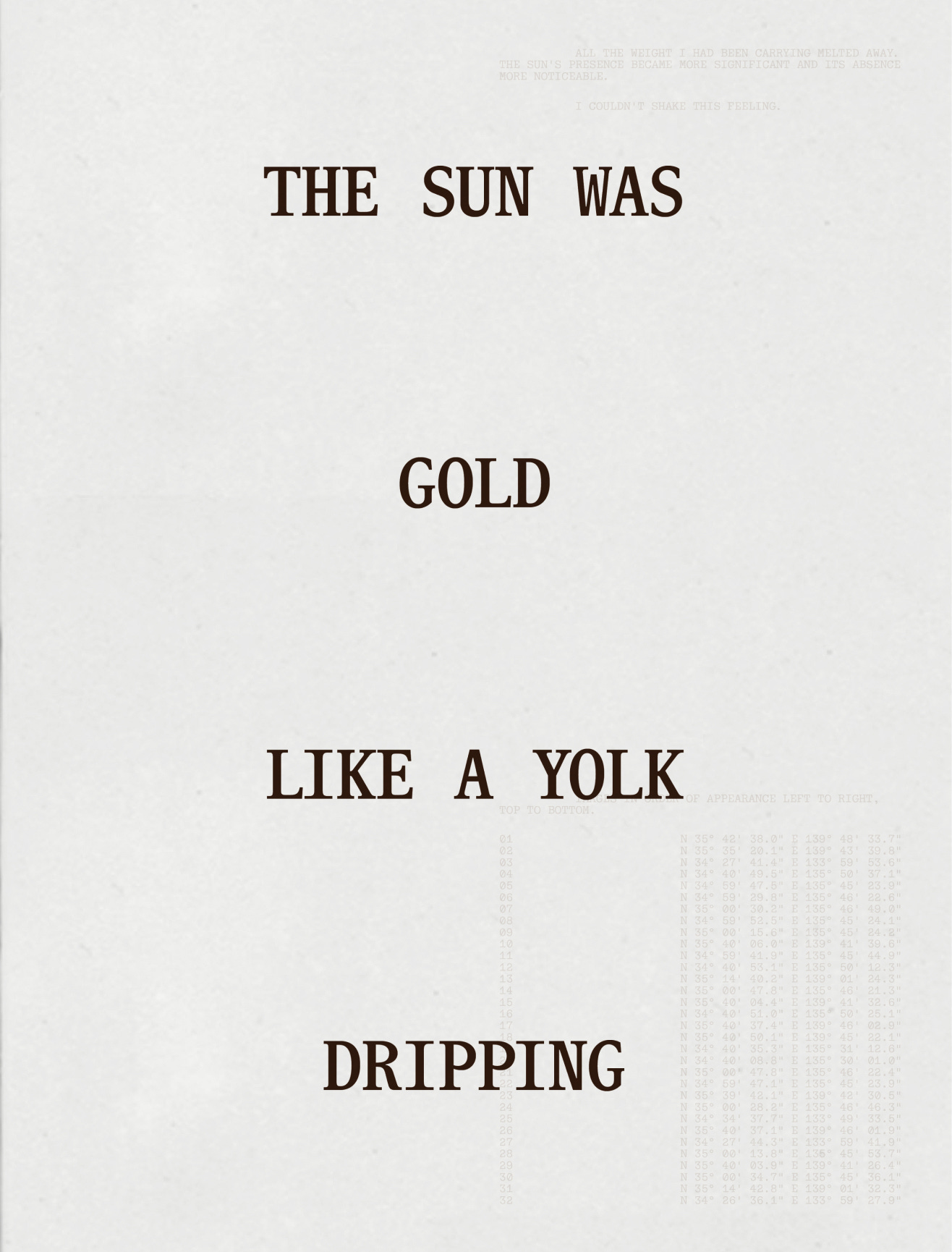
The Sun Was Gold Like A Yolk Dripping
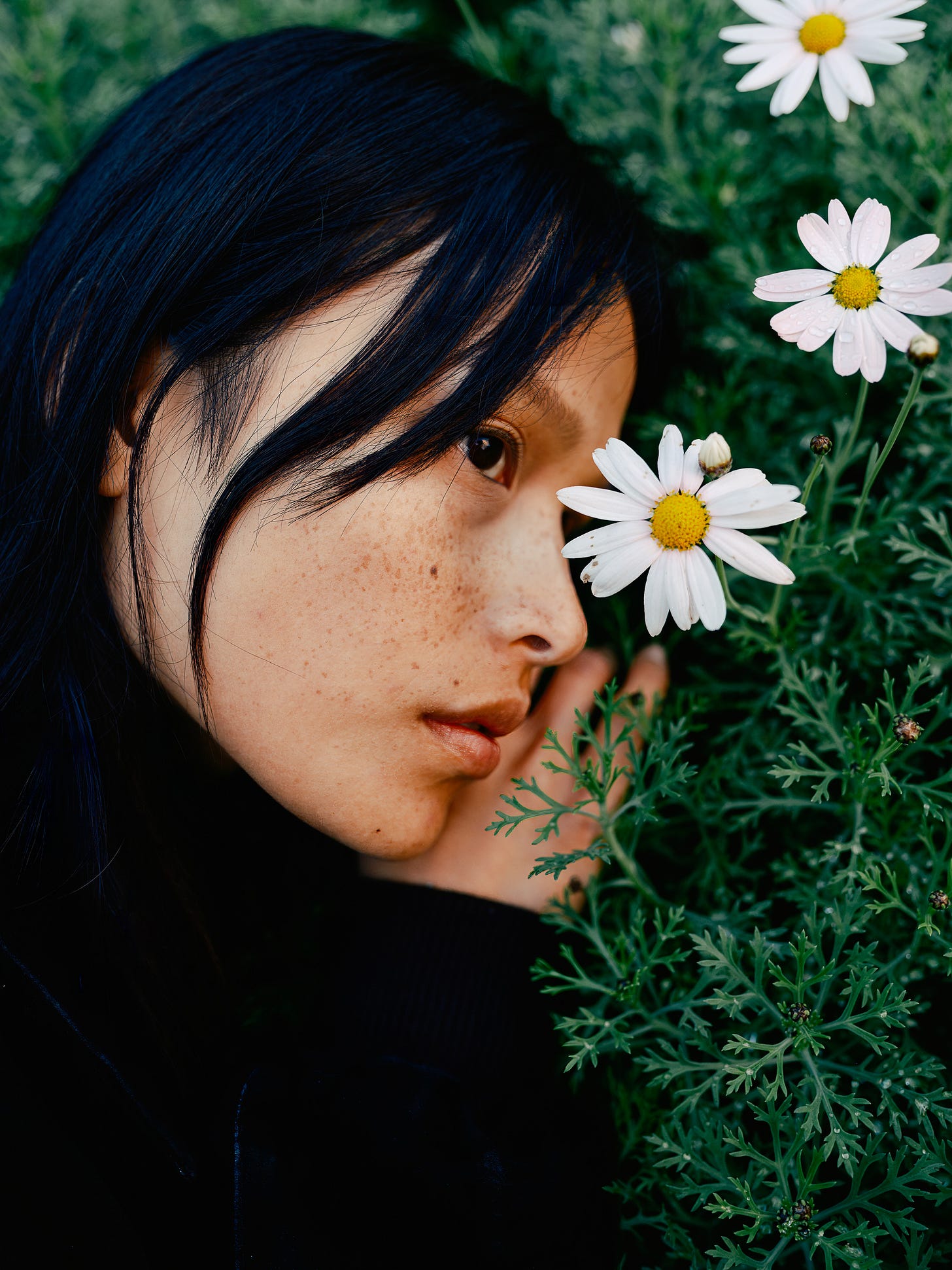
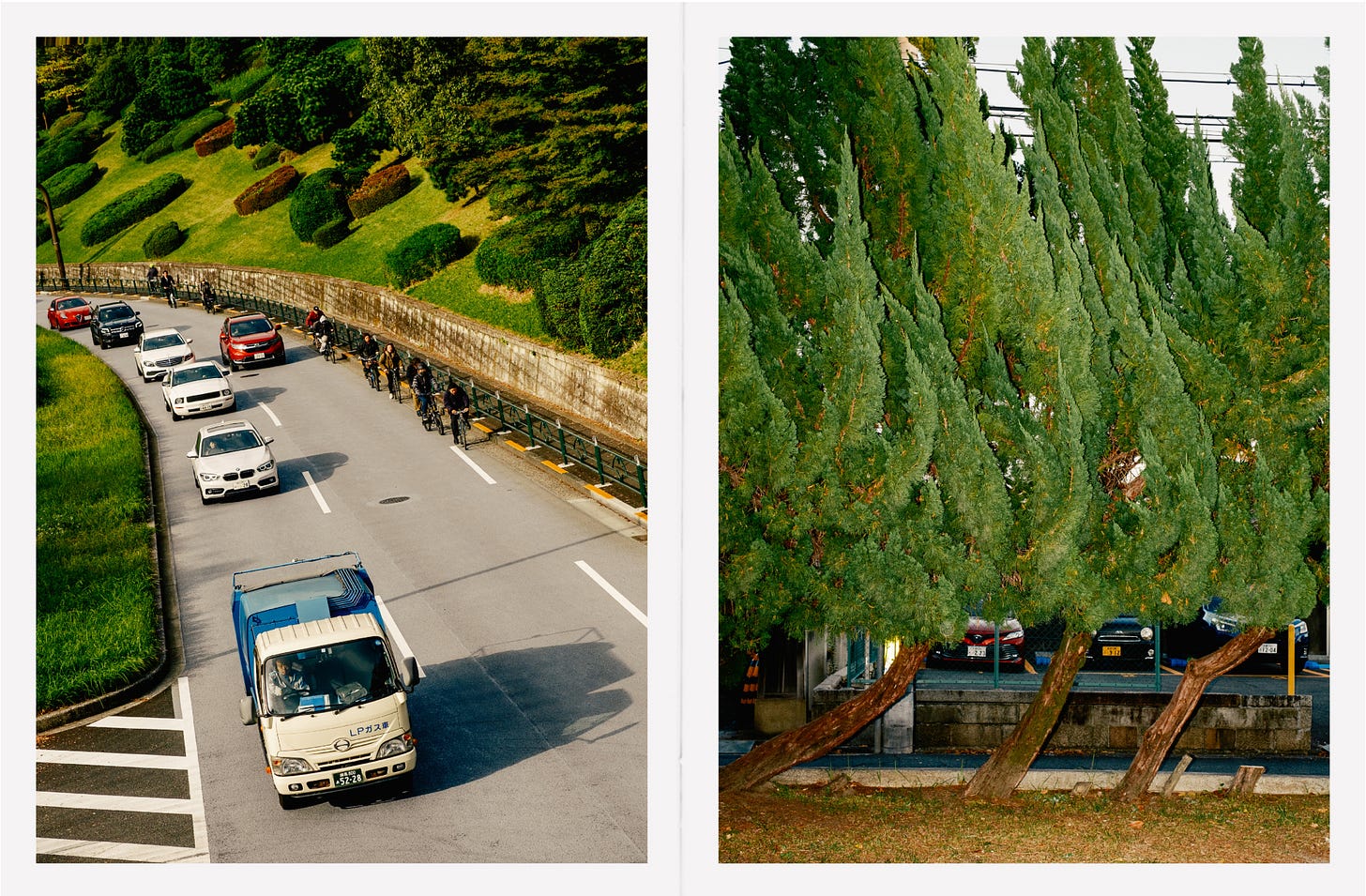
This past November, I spent seventeen days traveling around Japan for my honeymoon. The pandemic had delayed our celebration for three years, but after spending our first night exploring Tokyo, I knew it was worth the wait. 2023 was a challenging year for me, both professionally and personally, but Japan was a bright spot. Although I planned to work while in Japan, I didn't expect to create an entire zine. My camera was constantly at the ready and my eyes buzzed across the landscape during our long walks.
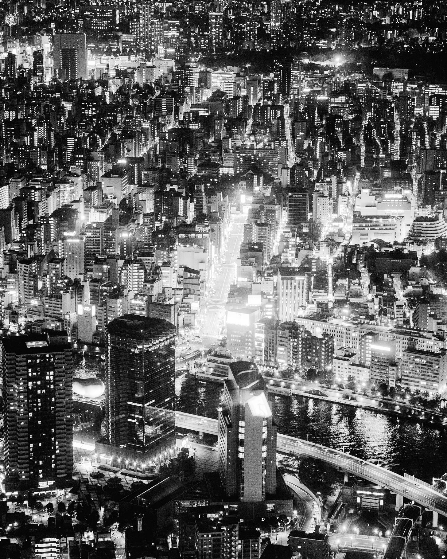
The day we landed in Tokyo was my 35th birthday. To celebrate, we decided to wander the night streets until we saw something that compelled us to stop. That something was a wooden storefront that had frosted windows and a sign that read, “Bar”. With no way to see what was inside, we took a step of faith to find out what was on the other side. Cigarette smoke filled the room of this hi-fi listening bar with fine Japanese whiskey, 1960s American folk music, and Lucky Strikes for sale behind the counter. “No photos allowed” a sign read and I settled into my bar seat with pure bliss about where instinct lead us. I felt a sense of weightlessness, all stress dissolved, and I appreciated the beauty around me. The rest of the trip was filled with constant surprises like the Ryuichi Sakamoto installation at Ambient Kyoto or the meal at Monk off the philosopher’s path.
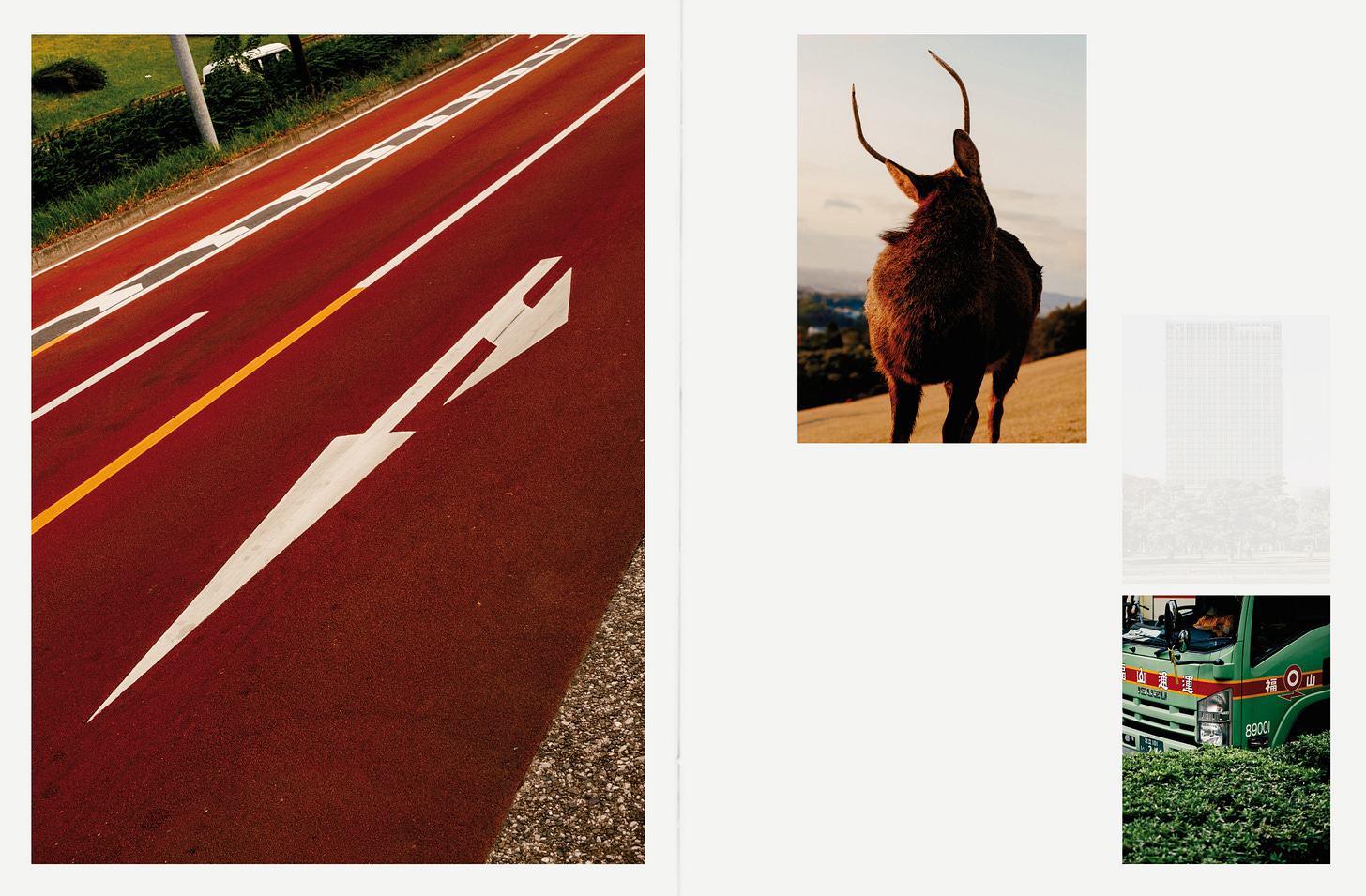
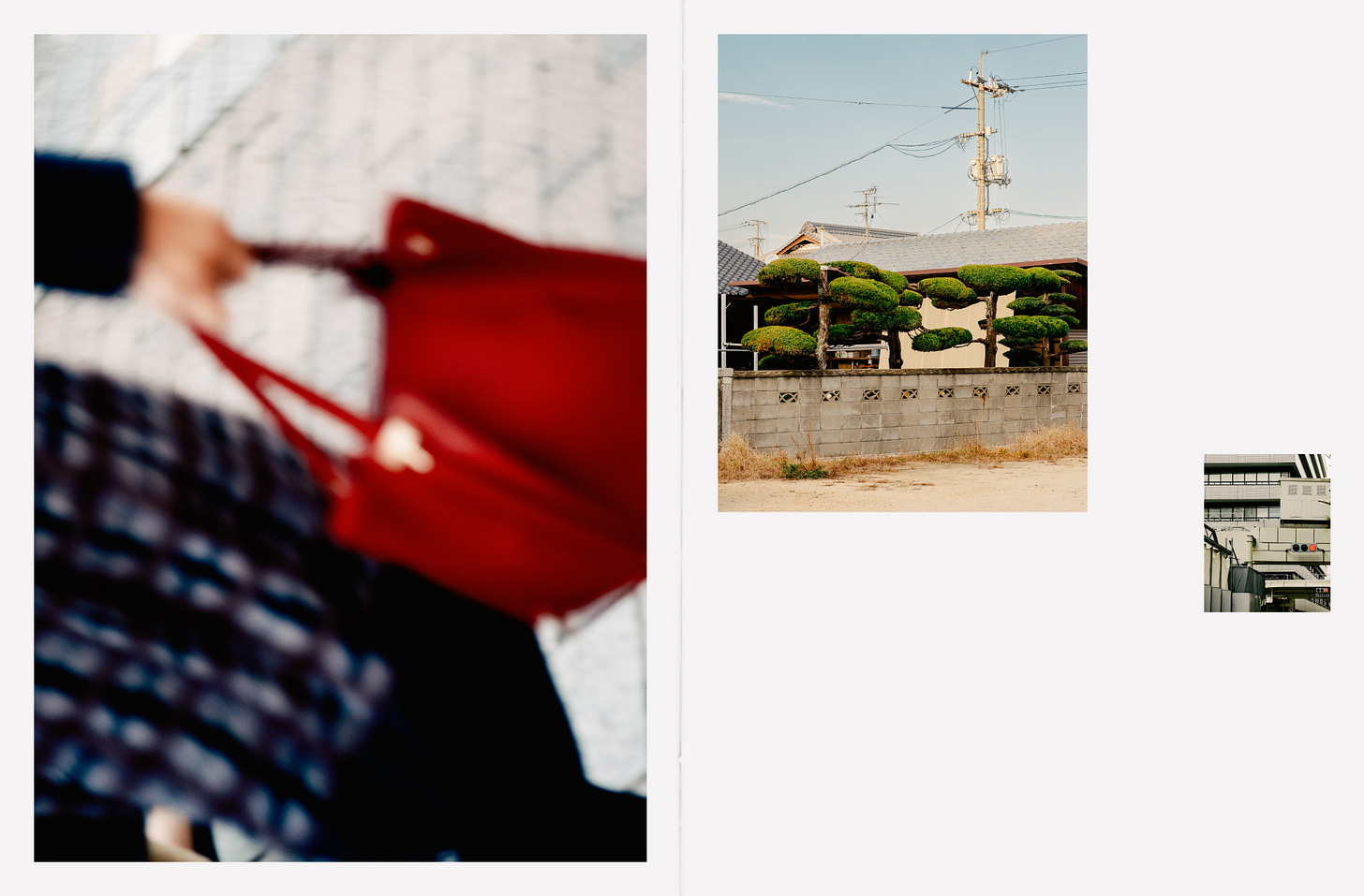
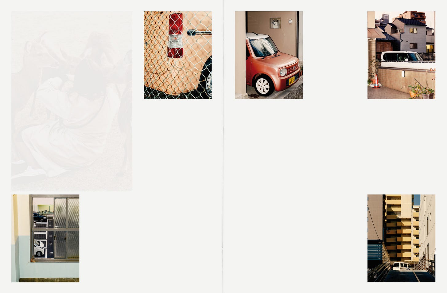
This was my first time going anywhere in Asia. Anticipating some level of culture shock, I was surprised by my fascination with the architecture, kei trucks, and the rich, golden sun. The cities were dense, and the countryside open. I was captivated by the organized chaos of Tokyo, and equally by the serenity of viewing Mt. Fuji from the Hakone Ropeway over the sulfur field. I aimed for the images and sequence to reflect the harmony between these two contrasting realities. As our journey progressed, I felt this harmony within myself and sought it each time I stepped outside.
Writing and Title
Writing is a challenging process for me. I tend to overthink, and my grammar skills could use some improvement. However, one of my New Year's resolutions was to incorporate writing into my daily routine. Using a technique from the Artist's Way (shoutout to my college roommate, Russell Kramer, who gave me my first copy!), I've started doing morning pages again.
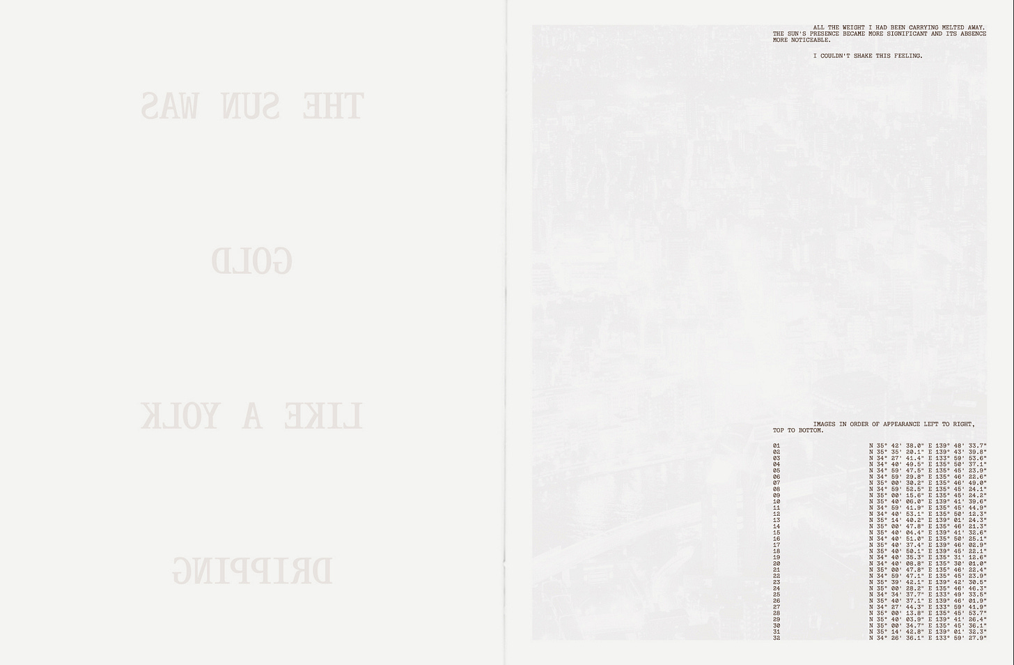
Most days, I set a timer and begin writing in a stream of consciousness, aiming to see what materializes on the page. This process allows me to explore my feelings and uncover nuggets of self-knowledge. For instance, during this exercise, I came up with the poetry for the zine: “All the weight I had been carrying melted away. The sun's presence became more significant and its absence more noticeable. I couldn’t shake this feeling.”
While it's not a groundbreaking revelation, this practice is helping me develop my ideas and challenge myself. And what more can we ask for in life than self-improvement?
Design Process
For this project, I teamed up with Christina Hogan to design the zine. Christina, an exceptional designer who also crafted my current website, had earned my trust from our previous collaborations. My vision for the zine was to highlight both the manic and serene aspects of the trip through strong design elements.
For the organized chaos in my design, I drew inspiration from Daniel Arnold's Pickpocket. Romke Hoogwaerts' Mossless 4 influenced the pairing of different types of imagery. Maurissa De La Mora & Ryan Beckemeyer's automapoems guided the typography and layout. Christina embraced these references with a clear vision from the start. The blend of grids to accentuate chaos and spreads to underline the vastness of landscapes is evident in the final design.
I’m grateful for this trip for opening my heart, my mind, and my eyes to a (mental) state I’ll never forget. If you want to see the full edit, check out the rest on my website.
Ed Ruscha for The New York Times
This past summer, I had the thrilling opportunity to photograph Ed Ruscha in his studio. Despite not being able to sit for a formal portrait, primarily due to his physical limitations, Ed was quite generous with his time and eager to share stories about the pieces in his studio. I explained our goals, respecting his wishes, and showed him one of my images for reference. He asked who took the photo and seemed surprised when I told him it was mine. His response was, "that's beautiful." The art school kid in me screamed at the top of my lungs, but I kept it cool IRL. I can die happy now.
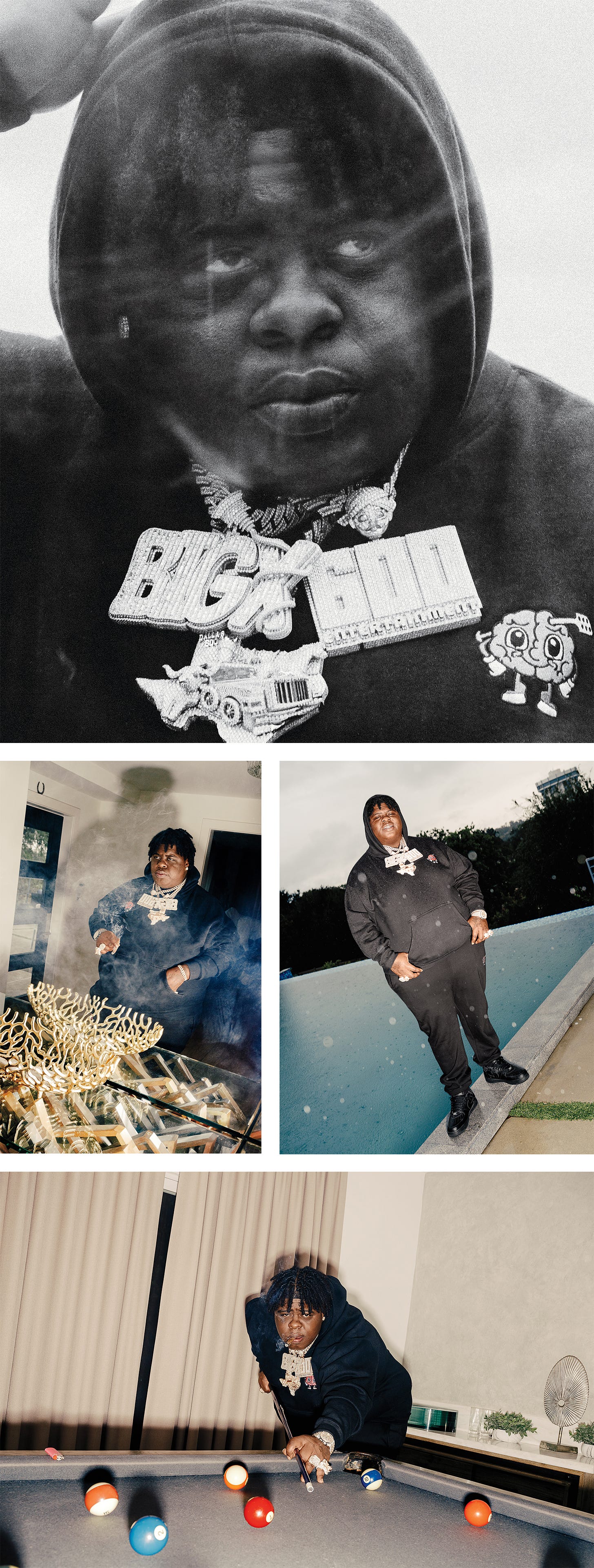
BigXthaPlug for Billboard Magazine
36 Hours in Death Valley
Various Works
Current Inspiration & Various Links
Current Reading: Smilla’s Sense of Snow
Current Listening: Alice Coltrane - Going Home
Current Art Book: Jim Mangan - The Crick
Current Watch: True Detective: Night Country
Current Restaurant: Houston’s in Pasadena (seriously lol)
Can’t Let It Go: Sauron from LOTR but if he was Trump


